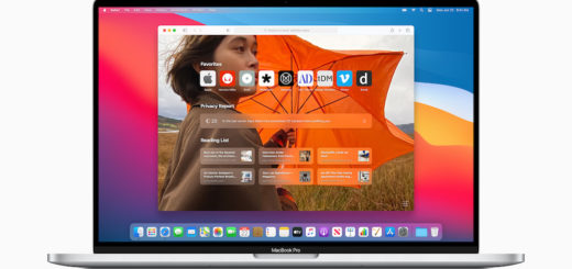
Apple’s Mac OS 11 icons are the prophets of ‘Post PC’
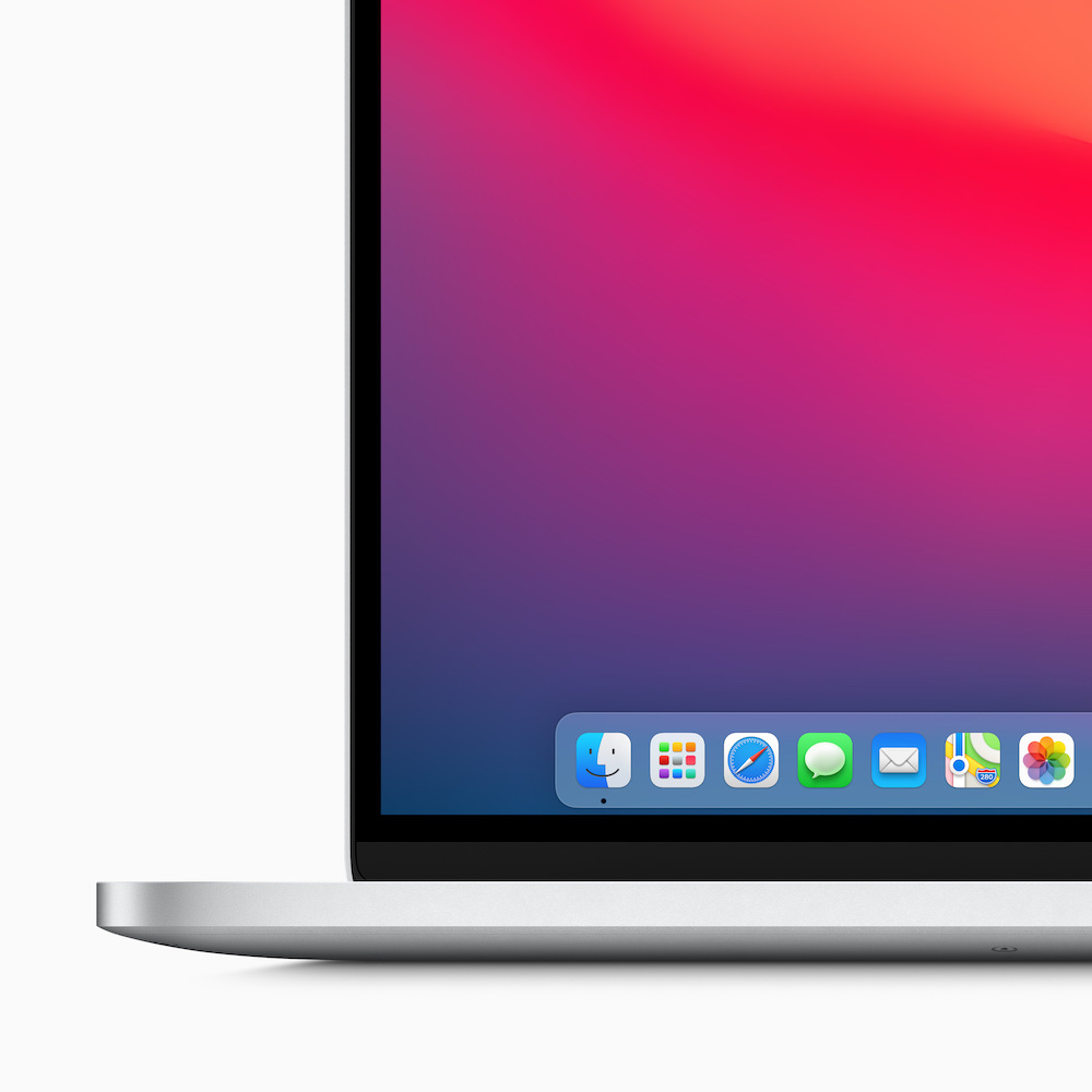
New Dock icons are more than you think
Apple says it redesigned the Dock buttons so they would look a little more like those used on iOS, in order to “be more consistent with icons across Apple’s ecosystem while retaining their Mac personality.”
What it said
“App icons combine a rounded-rectangle shape, a front-facing perspective, and a consistent drop shadow to provide a unified visual experience,” it says.
This unified user experience field theory should be that anyone on any Apple platform should be able to intuitively use the apps they are used to using on any other Apple platform with no need to relearn anything.
That extends to the icons and every other part of the user interface – touch, gesture, pointer, keyboard, voice – the experience of using any or all of these should be fundamentally the same across all Apple platforms, limited only by what makes the most sense on that particular device.
You don’t want to point at a Mac.
Though some users already do precisely that.
In future, you won’t expect to use a real keyboard and mouse when working on a Pages document using Apple Glass – you’ll use gesture and voice instead – and it will share the same icon, probably.
Think different.
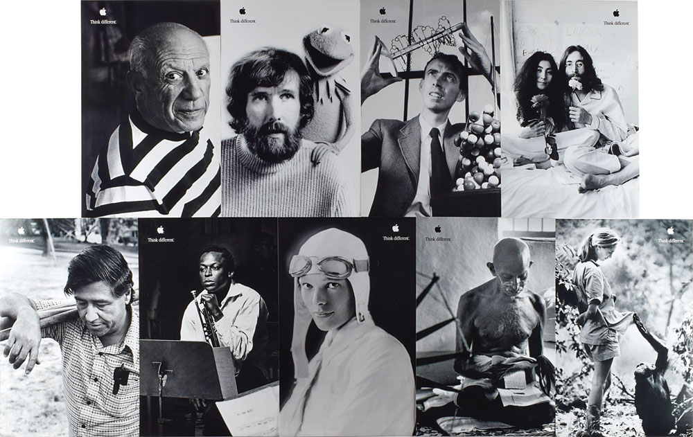
The crazy ones
The never-ending story
We know Apple is fully invested in AR.
CEO, Tim Cook has been talking up these investments since 2017, when he described the space as “big and profound”, predicting no sector would be untouched by it.
Since then, Apple has purchased almost ten AR-related companies and introduced a plethora of improvements to its ARKit solution, which reached version 4 at WWDC.
The problem with these efforts to create a new user interface for a virtual computing age must surely be the challenge to create solutions that just feel “right” when you use them.
User interfaces should offer a sense of “inevitability” – when you use them you should feel like there was no other logical way you would ever use them.
Delivering experiences that don’t match that profound feeling of inevitability means whatever is introduced is then perceived as being less good than alternatives that already exist.
It takes time to make things simple.
Anyone can create unsatisfactory complexity.
Training times
One way to help build that feeling of simplicity may be to help potential users get used to the principles of how new UI elements work before you introduce them, so they feel completely intuitive once they arrive.
Think how the iPod ClickWheel eventually informed the UI used in the iPhone. Do you really think this was coincidental?
Ensuring a consistent language around icon design seems a viable place to nurture such familiarity, given the highly visual nature of AR.
Icons that are recognizable across every device that themselves deliver increasing quantities of 3D interactivity.
As above, so below
If you think about it, if virtual experiences work on glasses, they should also function on any other display, which suggests some of the future direction for macOS 11 and iOS. It means additional gesture and position-based UI elements will eventually appear across both platforms.
The experience of being in virtual space should (I think) also become part of the interaction with other devices.
Perhaps this is why Apple has worked so hard to deliver its own graphics technologies with Metal and to provide industry-leading processor designs capable of powering such computing experiences.

These experiences could extend to where a person happens to be in the physical world.
Apple seems to be investing in technologies that might support this. Think about the spatial positioning inside the U1 chip used in the current iPhone, or gaming technologies it has built such as Swift Shot.
Apple’s 2017 purchase of eye-tracking firm, SensoMotoric Instruments surely relates to eye gestures as a future UI element. Following this train of thought, if eye tracking is indeed part of the interface the company is building for future AR glasses, then it seems inevitable we’ll also find it entering the Mac, iPad or iPhone experience.
We see a hint of these interfaces within the accessibility tools Apple works so hard to build.
Those icons will travel
We’ll become as accustomed to interacting with these 3D icons now on Macs on any Apple device.
It’s all about competition and evolution.

A series of incremental innovations fed into the ‘surprise’ 2007 launch of the iPhone.
Just as you can argue that the iMac begat the iPod which itself spawned Apple Services, the iPhone and the Apple Silicon Mac, so too can you argue that Apple’s greatest effort it its continued attempt to compete with itself.
It has never minded cannibalizing existing solutions to make way for new.
Apple also understands how to deliver incremental innovation. That’s what these new icons represent. A step that will support another step, until that big reveal. You know it’s coming.
Please follow me on Twitter, or join me in the AppleHolic’s bar & grill and Apple Discussions groups on MeWe.


