Apple’s secretive design department opens up to Wallpaper
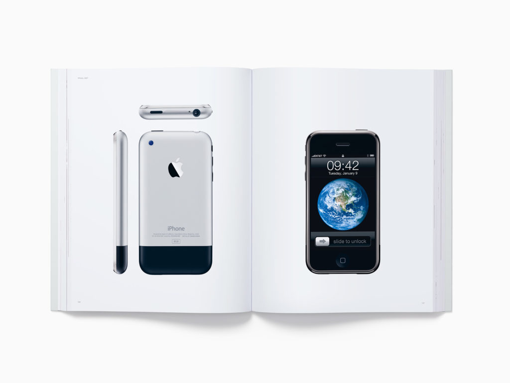
Who else remembers this book?
In another report that’s going to end up becoming source material for Apple historians, Wallpaper has published an exclusive look inside the company’s top secret design department, formerly led by Jony Ive.
A great sense of how Apple’s design team works
Illustrated with amazing photographs from inside the Apple design department, the reporter was taken on a guided tour by design leaders Evans Hankey and Alan Dye.
This is the first time such a tour has taken place – and you can see the amazing internal architecture that helps define this creative space, along with images that give us a little insight into how the designers at Apple work. (You may also want to read this previous 2016 Wallpaper interview with Jony Ive).
Evans Hankey, Apple’s VP of industrial design, and Alan Dye, VP spoke on how the company tries to make designs personal and try to create solutions that please customers, shareholders and can be manufactured without depleting resources and hastening climate change. That should give you some sense of how deeply entwined Apple’s environmental teams now are in product development.
Purpose and process
“We care about making great products, but we’ve worked equally hard at making a great team and culture. A lot of that came from the beginning. Steve defined Apple by its design,” Dye said.
“We always remember him saying that design is not just a veneer. It’s not just how things look, it’s about how things work.”
You emerge from the report with a sense of the space the designers work together in, and a glimpse into how they explore multiple design iterations as they hone into crafting good products.
We also learn a little about the teams, which include fontgraphers, ergonomic experts, psychologists, industrial designers and more.
[Also read: 6 Things You (Probably) Didn’t Know About Apple Park]
One interesting section you may enjoy is how the company designed the AirPods. They didn’t just sketch them on an envelope, instead they worked with academics, scanned thousands of ears and worked from a huge catalog of data concerning what ears are and what they need. In-house prototyping tools also help the teams, with designers creating solid iterations of in-design products – and they make things for each other at Christmas.
Another sense you emerge from the Wallpaper article with is that sense of detail. These designers really do look at the detail (though I wonder about tabs in Safari), so even the brand-new paper-based packaging was the result of a rigorous design process.
You’ll gain insights into the company’s approach to industrial design, typography, the company’s own history, material and hardware science, accessibility and more – you even see a few prototypes.
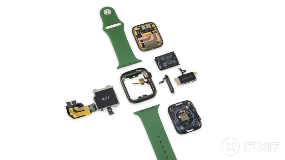
Every component is focused and thought through, designers suggest
A glimpse at Apple Watch
One product the team did seem keen to talk about is the Apple Watch, which is frequently referred to in the report. Yes, they are focused on Apple Watch Series 7, but there’s plenty of food for thought.
For example, on the Digital Crown, designer Molly Anderson admits the design was inspired by the history of watches, along with a need to build some form of physical connection between the user and the object on their wrist.
The objective throughout all of that work has been to enhance that personal interaction. Though the designers explain this much better in the full Wallpaperreport, which I think most Apple watchers will want to read.
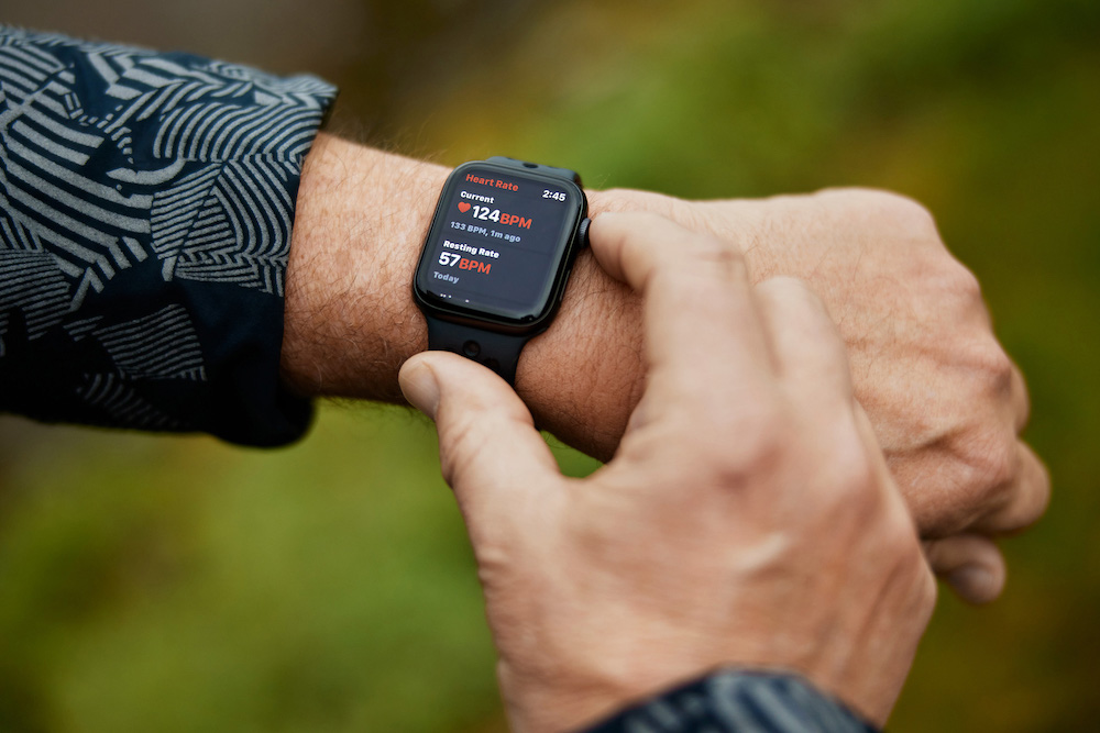
Keeping it physical with Digital Crown
“So much of what we value for the team and for the company, really started in the early days of design at Apple,’ says Hankey.” One more thing, of course, the piece makes a plea for presence-based collaboration, and explains the function of Apple Park as a tool to nurture that approach to work.
Take a look – and please also read Here is why Apple’s Steve Jobs loved to walk and so should you.
Please follow me on Twitter, or join me in the AppleHolic’s bar & grill and Apple Discussions groups on MeWe.
