How Apple must improve TV app content navigation
Just a little more control
I was using Apple’s TV app recently, and it struck me that while the app does an OK job as a one-stop source for all your television and movie content, it’s also remarkably inflexible. That’s because, unlike apps on the TV Home screen, you can’t personalize it at all.
Why can’t we make TV more personal?
I personally prefer the Apple TV interface both Amazon Prime and Netflix (I use them both), and Disney Plus is a step in a similar direction. Use of Siri, editorial recommendations and personalization based on the content I watch is useful, as is the provision of selections from most of your available television apps all on one page.
But that’s also a problem because as you add more TV apps and subscribe to the TV Channels Apple also makes available you find you need to scroll further and further down the page to find what you need.
The thing is, Apple has adopted a relatively simple design ethic for the TV app.
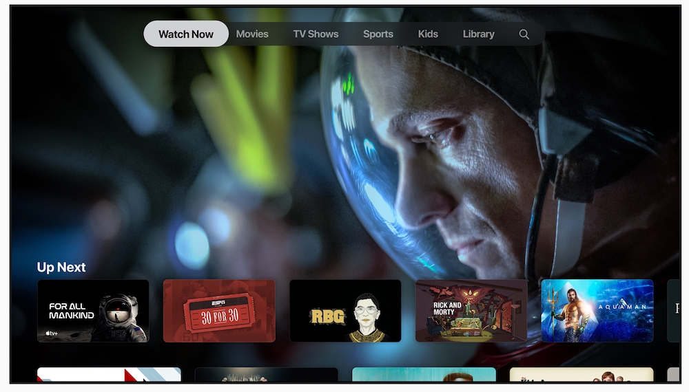
For the most part, this consists of rows of content in clearly defined categories: Drama, for example, Recently Watched, or Up Next. That’s neat, but why are Channels – which Apple evidently wants us to sign-up too – hidden halfway down the page?
Unless you know what they are and that they are there you try explaining where to find the BFIPlayer content to a visiting relative. (Yes, there’s also a row of BFIPlayer content, but that’s not the point).
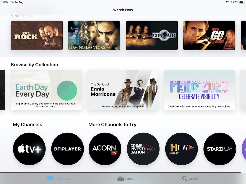
Why can’t I move Channels higher up the screen?
More power to the people
I think Apple needs to give users a little more power over configuration in the app.
Specifically, I’d like it to be possible to raise specific content rows Channels to nearer the top of the screen, along with icons that lead you into content selections from any specific TV apps you may also have access too through Apple’s own (iPlayer, Channel 5 and ITV, for example).
I also think users should be able to set the order in which the rows appear.
I’d expect the first rows to remain under Apple’s control, (Up Next, What to Watch), but think it would be sensible to be able to raise your most popular content sources up the screen for ease of discovery.
Here in the UK, I’d keep Latest Movies, Channels, TV+ and BFIPlayer right at the top. It should also be possible to set this on a per-device basis, or, using iCloud, across all the devices you use to access TV app.
Families will need to be able to assign personalised content navigation ordering on a per user basis – the argument being that Trevor (13) will have a completely different set of chosen content selection choices than his 55-year-old grandmother. She might want to explore Apple’s collection of Pride-related movies, while Trevor might be hooked on See, for example.
Perhaps there’s a reason Apple hasn’t done this, but surely it makes sense to ensure TV app users can swiftly source and select the content they want.
Do you feel the same? Please let me know:
[CP_POLLS id=”51″]
Please follow me on Twitter, or join me in the AppleHolic’s bar & grill and Apple Discussions groups on MeWe.
