How to translate, make pivot tables in Numbers, Keynote & Pages
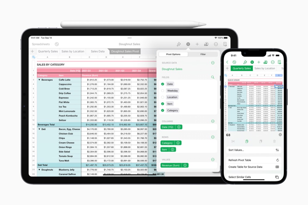
Apple recently poured generous improvements over Keynote, Pages and Numbers, its three no-cost Office alternatives, making them even more capable occasional replacements and reliable reinforcements for enterprises based around Office 365.
What is iWork?
Available for free on Apple’s platforms, the iWork suite consists of Keynote, Pages and Numbers. Respectively, these let you create presentations, make effective documents, and build spreadsheets and charts through an elegant user interface.
The latest updates add more powerful chart types, a new mobile view for Pages documents, in-presentation video captured by the front facing camera and automated translation across all three apps.
The apps can open items saved in Microsoft Office formats and can also save in those formats, but for many users (particularly in education), Apple’s apps may provide all the productivity tools they need. The recent updates extend what they can do in what seems to be useful ways.
Translate your documents
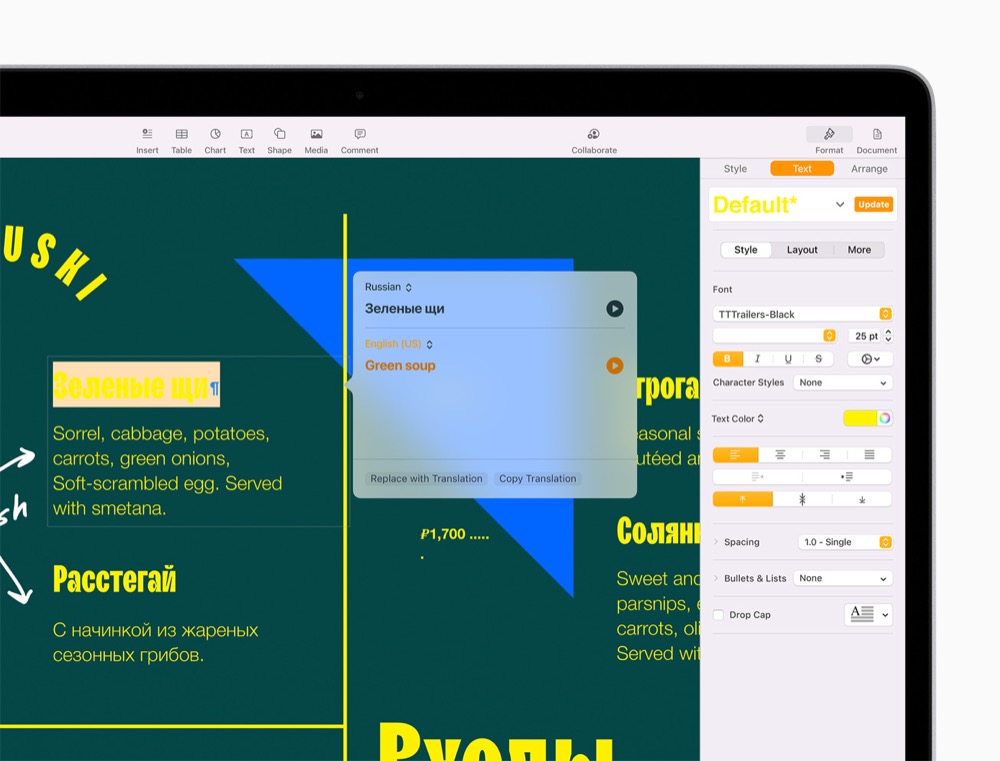
If your business needs to prepare documents in multiple languages all three apps now support the new translation tool built into iOS 15, iPadOS 15, and macOS Monterey. This makes it simple to localize documents and presentations while maintaining control of the overall design, which may come in useful to some professionals.
Just select the text, choose the language and you’ll quickly see a translation. You can hear it read aloud and replace the selection with the translated text.
Get more data from your data
Another addition is pivot tables. Yielding useful information from raw data benefits from having lots of ways to present and crunch that information. Numbers now provided pivot tables, which let you quickly summarize, group, and rearrange data to identify and analyze patterns and trends.
These are easy to use:
- Open the spreadsheet and tap the Pivot Table button
- You’ll be shown a range of Pivot Options, these basically permit you to select which data fields you want to use.
- Numbers will immediately create the relevant chart from your raw data.
A sales chart may only require quarterly sales, location, and revenue for example. Numbers will create the chart quickly, making it easy to summarize the information you need and lose the data you don’t.
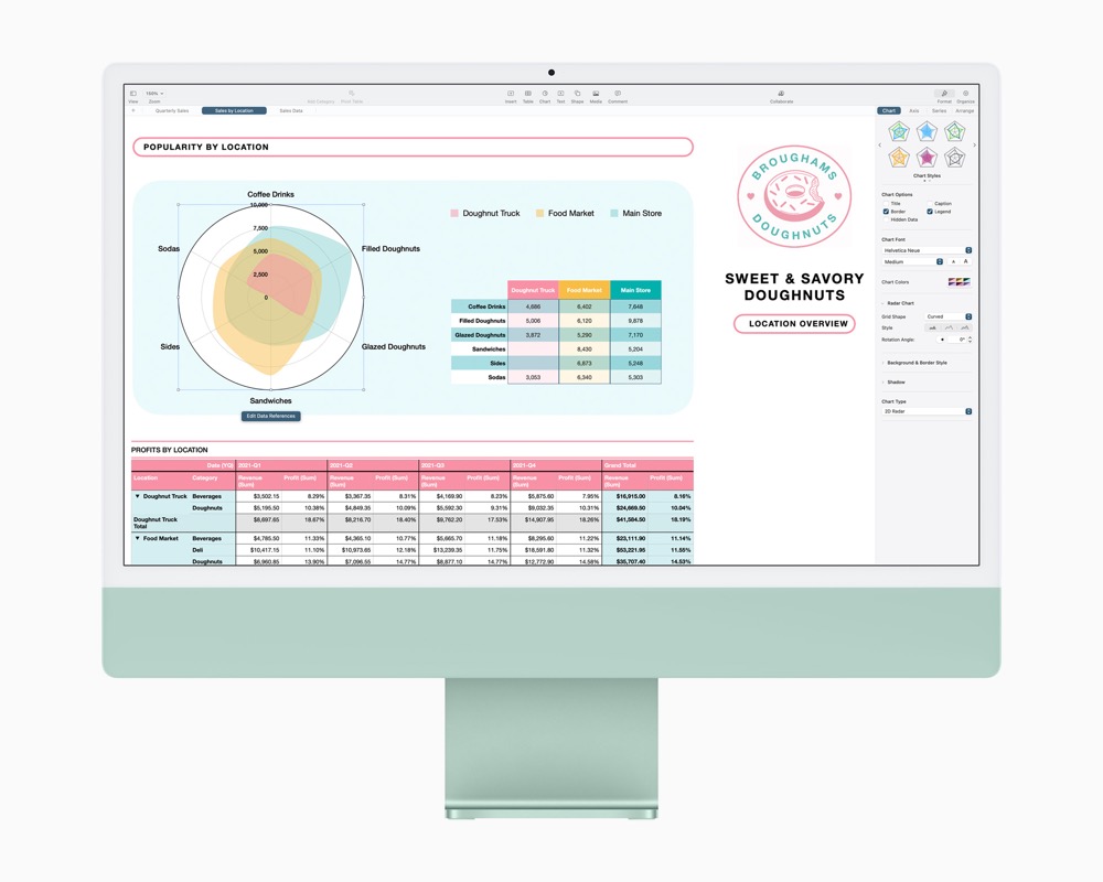
Numbers also gains radar charts (above), an industry standard approach to depicting multiple variables.

Putting you in the picture
The downside of data presentations using online collaboration tools such as Zoom is that we tend to present in full-page view.
This makes it hard to emphasize points with non-verbal body language cues, because the presenter cannot be seen.
Keynote fixes this, not only can you use the front-facing camera to add video directly within your presentation, but you can also use it to film yourself as you present. That live video will then appear in a box wherever you want it to be in your presentation, which of course makes it possible for you as the presenter to better articulate what you are attempting to explain.
On Macs, this support extends to wirelessly connected webcams, enabling the creation of quite complex video within the presentation. This should also be of use when presenting tutorials, lectures, or for those endless HR meetings.
Live video appears as an option in the Keynote Edit menu. You’ll find it in the media section, where you can also place phots, videos, web video, images and more. Tap Live Video to add your feed to the presentation. Just remember to be prepared when you reach that slide.
Also new is support for multiple presenters, which makes it much easier for remotely distributed teams to make a presentation by putting the speaker in control of the slides.
I’ve heard that Apple makes extensive use of Keynote for its own internal presentations.
The application was originally built to support Steve Jobs when he made his own on-stage keynotes (the hint is in the name) and released to the public in 2003. Both these new improvements seem built to support a remote and collaborative workplace.

Visual Look Up is really rather smart
Pages for the rest of us
Apple claims people read Pages documents on their iPhone more than on any other device. While this probably indicates the limited dent Apple has made in the wider productivity universe with Pages, it does mean most of us have had to squint and swipe our way through more complex layouts. Now this stops thanks to Screen View, which automatically displays text, images and other elements in word processing documents an easy to read single-column view. You can also switch this view off if you want to verify the original layout or work on the document design.
Please follow me on Twitter, or join me in the AppleHolic’s bar & grill and Apple Discussions groups on MeWe.

