What is Apple’s True Tone and why should I use it?
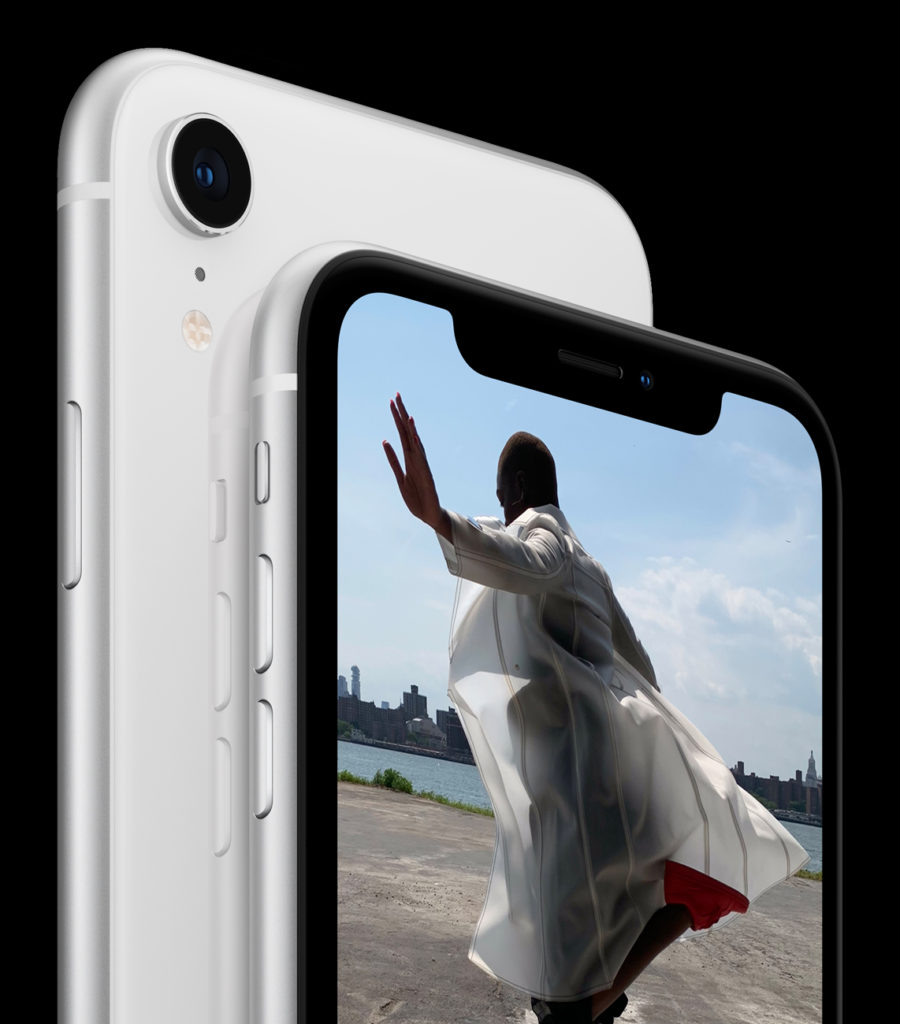
iPhone XR
Available on the current MacBook Pro, iPad Pros and the iPhone 8, 8Plus, XS and XR smartphones, Apple’s True Tone aims to reduce eye strain by making what you see on your display seem as natural as what you would see on a printed page.
What is Apple’s True Tone?
To achieve this, True Tone technology uses a smart six-channel ambient light sensor. This monitors the light around you and then tries to match the white balance you see onscreen to what your surrounding ambient light’s colour temperature happens to be.
This lets your eyes focus more normally than they do when staring at a bright display, because what’s on screen is balanced to your surroundings, mitigates glare, with the result you don’t need to strain your eyes too much.
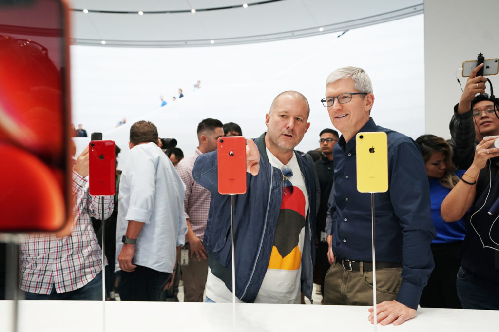
What devices support True Tone?
The following devices support True Tone:
- iPhone 8
- iPhone 8 Plus
- iPhone X
- iPhone XS
- iPhone XS Pro
- iPhone XR
- iPad Pro 9.7-inch
- iPad Pro 10.5-inch
- iPad Pro 12.9-inch (2017)
- MacBook Pro (2018)
What Apple says
On the iPhone XS website, Apple states:
“True Tone. A six-channel light sensor subtly adjusts the white balance onscreen to match the color temperature of the light around you. So images on the display look as natural as on a printed page and are easier on your eyes.”
What about Night Shift?
I’m glad you mentioned Night Shift. Around from iOS 9.3, Night Shift sought to reduce screen glare by setting your display to a more subtle (usually kind of a sepia) color when using the device at night.
True Tone is smarter. Not only does it respond to lighting conditions around you at any time of the day, but it does so intelligently, thanks to built-in device intelligence and data from those six light sensors.The aim is to make the brightness of the display act in a very similar way to how different types of light illuminate your newspaper.
The other advantage True Tone has over Night Shift is that it can be on at all times, you don’t need to set it for use at particular times of the day. Night Shift wasn’t smart enough to think for itself, you see.
How to toggle True Tone on or off
There are some users who choose to turn the feature off because they just cannot become accustomed to the slightly darker screen you’ll see when using True Tone in a dark place.
True Tone is enabled by default on current devices. Here is how to toggle True Tone on or off:
- On iPhone open Settings>Display & Brightness, and toggle True Tone off or on.
- iPhone users can also get to True Tone controls via their Control Center. In Control Center just tap and hold the brightness slider until the large version of that slider shows up. Underneath you will see separate controls for both True Tone and Night Shift.
- On a Mac that supports the feature, you’ll find a similar control in System Preferences>Display.
What problems does this solve?
The attempt to reduce eye strain is a completely valid approach to a real problem. There have now been multiple research studies, (including a well-publicised one from Harvard) that prove staring at a computer screen can impact sleep patterns and damage people’s eyesight.
Harvard warns:
“While light of any kind can suppress the secretion of melatonin, blue light at night does so more powerfully. Harvard researchers and their colleagues conducted an experiment comparing the effects of 6.5 hours of exposure to blue light to exposure to green light of comparable brightness. The blue light suppressed melatonin for about twice as long as the green light and shifted circadian rhythms by twice as much (3 hours vs. 1.5 hours).”
That suppressed melatonin makes it harder to sleep, harder to remain asleep, and may have an impact on other health challenges, such as diabetes.
[amazon_link asins=’B004ZVHKJE’ template=’ProductCarousel’ store=’9to5ma-20′ marketplace=’US’ link_id=’6bf85357-c7be-11e8-95cd-51f6e0186519′]
Why should I use True Tone?
Making a display warmer and more natural (as Night Shift and True Tone both attempt to do) reduces the negative impact of using these screens.
The other thing to remember is that the amount of time we spend interacting with computing devices has increased.
We no longer just use them at work, we use iPhones and iPad on mass transit, in restaurants, while watching TV, in bed and even in the loo! That means the amount of time we spend staring at these blue-tinged computer screens has increased exponentially, prompting a wave of vision and sleep problems.
Making a display warmer and more natural (as Night Shift and True Tone both attempt to do) reduces the negative impact of using these screens. True Tone and Night Shift won’t completely prevent the problems associated with computer use, though an app like Screen Time may help educate us all just how much time we spend on our devices, but it will mitigate them.
[amazon_link asins=’B00Y3P0K1M’ template=’ProductCarousel’ store=’9to5ma-20′ marketplace=’US’ link_id=’cd80650c-c7bd-11e8-95cd-51f6e0186519′]
How can I reduce eye strain?
As well as using Night Shift and True Tone and being more mindful of how much time you spend using your computer, you can also follow some common-sense advice. (This comes from All About Vision).
- Get your eyes tested regularly
- Use proper lighting, avoid using a computer under fluorescent light
- Minimize glare (Hello True Tone)
- Get a better display – or smartphone. (Android need not apply).
- Adjust text size and contrast
- Blink frequently – it moistens your eyes and prevents irritation. Stating at a computer increases it. Blink now. Blink often.
- Eye exercises, eg: “Look far away at an object for 10-15 seconds, then gaze at something up close for 10-15 seconds. Then look back at the distant object. Do this 10 times.”
- Take breaks
Do you use True Tone? What other suggestions for responsible computer — Mac/PC/iOS use can you share. People’s health matters, so share your suggestions in comments below.



I get eye strain trying to read gray text on a gray or white background. (Like on this page) Why can’t the text be printed in black, and have good contrast with the background?